The Point chart is similar to the Lollipop chart in that it plots data points across Cartesian coordinates (an x- and y-axis that meet). Unlike the Lollipop chart, point charts display the data points only, without connecting them.
When working with Point charts, you can use the Color and Shape zones to easily construct complex yet sleek charts, that display multiple data points on each category.
Build a Point Chart
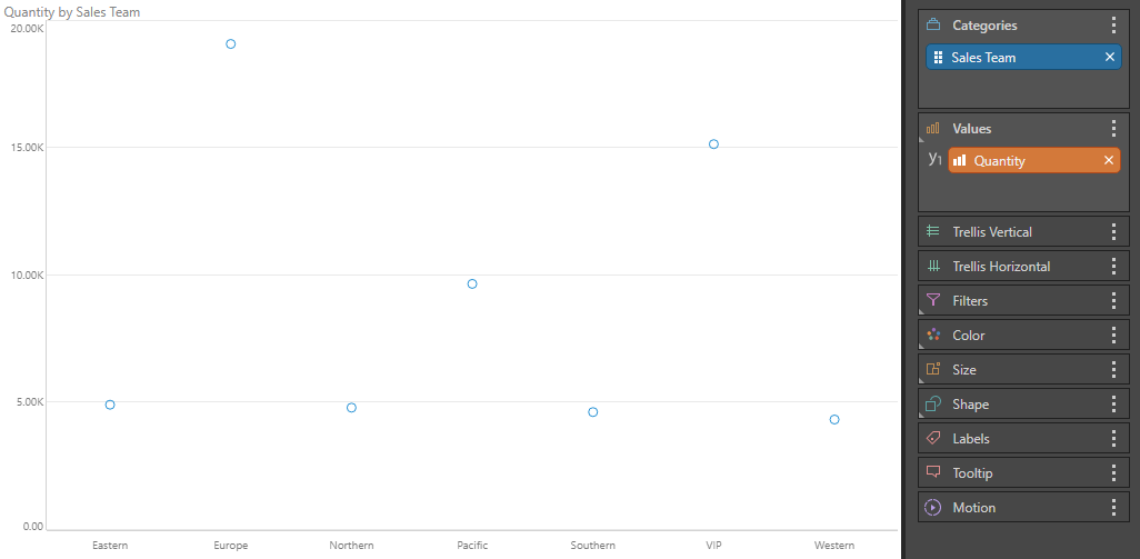
To build a Point chart, add at least 1 hierarchy to the Categories zone, and a measure to Values:
Examples
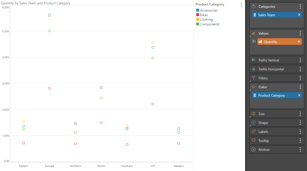
In this example, a second hierarchy, Product Category, was added to the Color zone. The chart color is now driven by the promotion type:
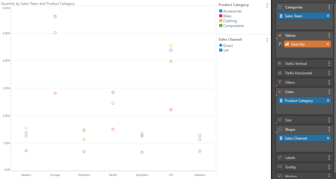
Here, a third hierarchy, Sales Channel, was added to the Shape zone. This hierarchy drives the data point shapes:
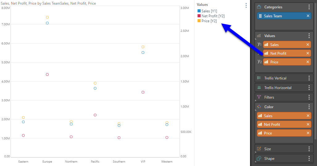
In this example, three measures were added to create a combo chart displaying multiple measures.